
Color is a fundamental element of interior design, capable of evoking emotions, shaping perceptions, and influencing behavior. Understanding the principles of color psychology is key to creating spaces that not only look visually appealing but also foster the desired mood and atmosphere. In this comprehensive guide, we’ll delve deep into the world of color psychology and explore practical strategies for incorporating it into your home design.
1. The Basics of Color Psychology:
Before diving into specific color schemes and applications, it’s important to grasp the basics of color psychology. Colors can be broadly categorized into warm and cool tones, each associated with distinct emotional responses. Warm colors like reds, oranges, and yellows tend to evoke feelings of energy, warmth, and excitement, while cool colors like blues, greens, and purples are often associated with calmness, relaxation, and tranquility.
Additionally, colors can have cultural and personal associations that influence their psychological impact. For example, while white is often associated with purity and cleanliness in Western cultures, it may symbolize mourning or loss in other cultures. Similarly, individual experiences and preferences can shape how people respond to different colors. Consider these factors when selecting colors for your home to ensure they resonate with your desired mood and ambiance.
2. Choosing Colors for Different Rooms:
When selecting colors for your home, consider the function and purpose of each room. For spaces where you want to promote relaxation and tranquility, such as bedrooms and reading nooks, opt for cool, soothing colors like soft blues, greens, and lavenders. These colors can create a serene and calming atmosphere conducive to rest and relaxation.
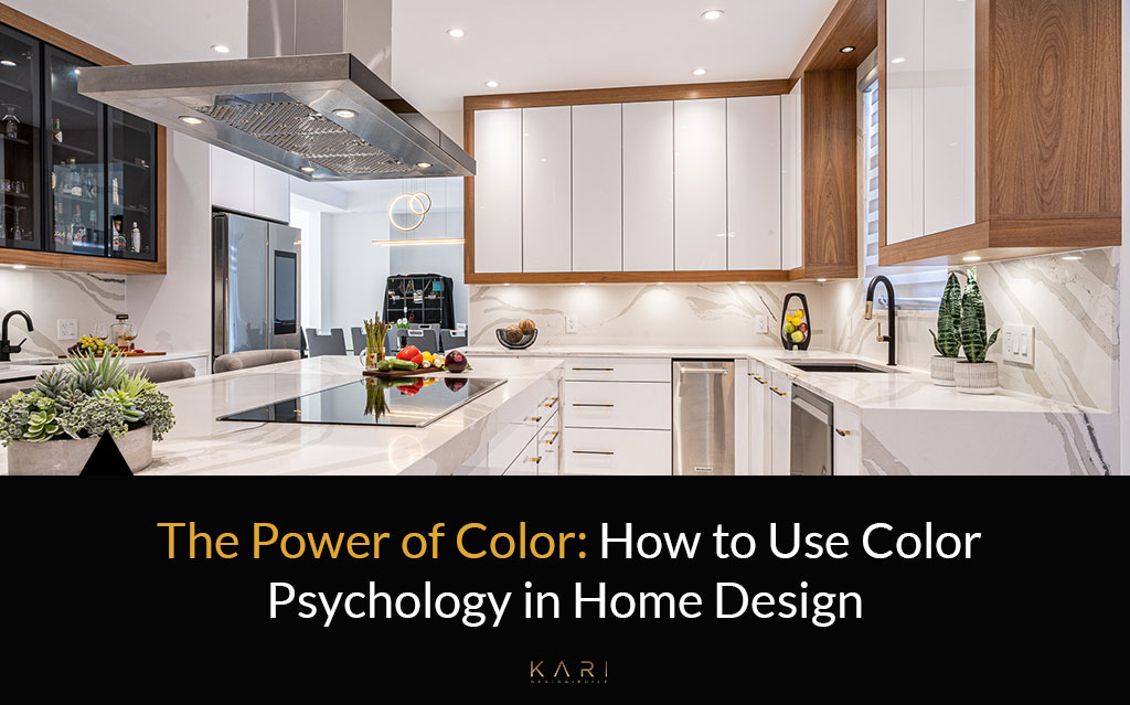
In areas where you want to encourage energy and activity, such as kitchens and home offices, choose warmer, more stimulating colors like yellows, oranges, and reds. These colors can help promote creativity, productivity, and a sense of warmth and coziness in the space.
Additionally, consider the size and layout of each room when selecting colors. Lighter colors tend to make small rooms feel more spacious and airy, while darker colors can add depth and intimacy to larger spaces. Experiment with different color palettes to find the perfect balance for each room in your home.
3. Creating Harmonious Color Schemes:
Creating a harmonious color scheme involves carefully balancing different colors and tones to create a cohesive and visually pleasing look. One popular approach is the use of complementary colors, which are located opposite each other on the color wheel. Pairing complementary colors, such as blue and orange or purple and yellow, can create a dynamic and vibrant color scheme that adds visual interest to your home.
Another approach is the use of analogous colors, which are located next to each other on the color wheel. Analogous color schemes, such as blue-green and teal or red and orange, create a more harmonious and cohesive look that is well-suited for creating a sense of unity and balance in your home.
Additionally, consider the role of neutrals in your color scheme. Neutrals such as white, gray, and beige can serve as a versatile backdrop that allows other colors to shine. Use neutrals for larger elements like walls, floors, and furniture, and then layer on pops of color with accessories, artwork, and textiles.
4. Harnessing the Power of Light:
Light plays a crucial role in how colors are perceived in a space. Natural light can enhance colors and make them appear brighter and more vibrant, while artificial light can sometimes cast warm or cool tones on colors. Consider the direction and intensity of light in each room when selecting colors to ensure they look their best under different lighting conditions.
Additionally, consider the use of lighting design to enhance the mood and atmosphere of your home. Soft, warm lighting can create a cozy and inviting ambiance, while bright, cool lighting can promote energy and focus. Experiment with different lighting fixtures, bulbs, and dimmers to find the perfect lighting scheme for each room in your home.
5. Personalizing Your Color Palette:
While color psychology provides valuable insights into the emotional and psychological effects of different colors, it’s essential to remember that personal preferences play a significant role in home design. Don’t be afraid to incorporate colors that resonate with your individual tastes, interests, and personality.
Consider incorporating personal touches and meaningful accents into your color scheme, such as artwork, photographs, and heirlooms. These personal touches can add depth and character to your home and create a space that feels uniquely yours.
Conclusion:
Color is a powerful tool that can transform the look and feel of your home. By understanding the principles of color psychology and how different colors influence emotions and perceptions, you can create interiors that are not only visually stunning but also conducive to your desired mood and atmosphere. Whether you’re aiming to create a serene sanctuary, an energizing workspace, or a vibrant social hub, harnessing the power of color in your home design can help you achieve your goals with confidence and creativity.
Experiment with different color palettes, consider the function and layout of each room, and don’t be afraid to let your personal style shine through. With a thoughtful approach to color selection and placement, you can create interiors that not only look beautiful but also feel harmonious and inviting—a true reflection of your personality and lifestyle.